Ever looked at your phone and wondered, “Why does Apple have a bite taken out of it?” or “What’s the deal with that Samsung wordmark?” Well, buckle up, because you’re about to discover that every single smartphone brand logo has a story that’s way cooler than you think.
These aren’t just pretty pictures that designers threw together during their lunch break. Every curve, color, and detail was carefully crafted to represent something meaningful.
Apple: The Most Famous Bite in Tech History
1. Is Apple Logo Created with a Bite Out of It, Just Because People Shouldn't Mistake the Apple for a Cherry or Another Fruit?
- A. Yes
- B. No
Let’s start with the big one. That Apple logo with a bite taken out of it? Yeah, there’s a reason for that bite, and no, it’s not about Eve and the forbidden fruit (though that’s a popular theory).
The real story: The bite was added so people wouldn’t confuse the apple for a cherry or tomato when the logo was small. Seriously! Designer Rob Janoff wanted to make sure everyone could instantly recognize it as an apple, especially on tiny computer screens and packaging. The rainbow stripes in the original 1977 logo? That was to show off Apple’s ability to display color graphics, which was revolutionary at the time.
Here’s something mind-blowing: The current sleek, monochrome apple we all know actually lost its rainbow stripes in 1998 when Steve Jobs returned to Apple. He wanted something more modern and sophisticated. And honestly? It worked.
Hidden detail: The proportions of the apple follow the golden ratio, making it naturally pleasing to the eye. Math and beauty combined!
Samsung: More Than Just a Name
You might think Samsung’s logo is just their name in a blue oval, but hold on – there’s more to it than meets the eye.
The meaning: “Samsung” literally means “three stars” in Korean. The founder, Lee Byung-chul, chose this name because he wanted the company to be powerful, everlasting, and high in the sky like stars. Pretty poetic for a tech company, right?
The evolution: Samsung’s logo has been through some serious glow-ups. The current ellipse design (introduced in 1993) represents the universe, showcasing Samsung’s global ambitions. The blue color symbolizes reliability and stability – basically telling you, “Hey, we’re not going anywhere.”
Hidden detail: Look closely at the ‘A’ in Samsung. The horizontal line is actually slightly tilted upward, suggesting growth and forward movement. Sneaky!
Xiaomi: The Grain of Rice That Conquered the World
Xiaomi’s logo looks super simple – just “MI” in a rounded square. But this Chinese tech giant packed some serious meaning into those two letters.
The story: “Xiao Mi” translates to “little rice” in Chinese, representing the company’s mission to make innovative technology accessible to everyone (as common as rice). The “MI” also stands for “Mobile Internet” and “Mission Impossible” – because Xiaomi loves tackling challenges everyone says can’t be done.
The design: That rounded square? It’s deliberately designed to look friendly and approachable, not intimidating like some tech brands. The orange color represents youthfulness and energy.
Hidden detail: The logo can be flipped upside down and still look the same. Some people also see it as a heart symbol, representing Xiaomi’s love for their fans (they call them “Mi Fans”).
Huawei: The Petal That Bloomed into Global Success
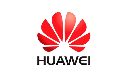
Huawei’s logo might look like a simple red flower or fan, but it’s actually eight petals with some deep symbolism.
The meaning: Those eight petals represent enrichment, convergence, and the coming together of different elements – basically showing how Huawei brings technology and people together. In Chinese culture, eight is considered the luckiest number, symbolizing prosperity and success.
The color: That vibrant red? It’s not just eye-catching – red represents passion, energy, and good fortune in Chinese culture. It also makes the logo instantly recognizable.
Hidden detail: The symmetry of the petals creates a sense of balance and harmony, reflecting Huawei’s philosophy of creating balanced technological ecosystems.
OnePlus: Never Settling for Ordinary
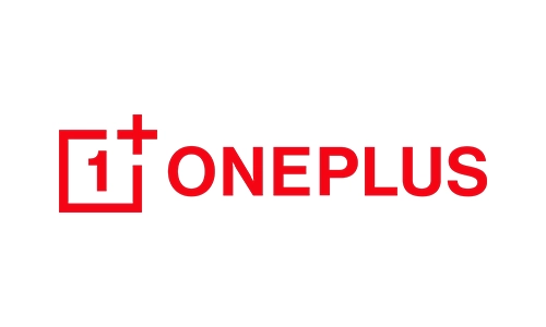
OnePlus keeps things minimalist with their logo, but don’t let that fool you – there’s philosophy baked into every line.
The story: The “1+” represents their motto “Never Settle” and their commitment to always being one step ahead. It’s simple, bold, and unapologetic – just like their brand personality.
The design: That clean, sans-serif font and the minimalist plus sign? It’s all about clarity and precision. OnePlus wants you to know they’re focused on what matters: performance and user experience, not flashy gimmicks.
Hidden detail: The spacing between the “1” and “+” is carefully calculated to create visual tension and movement, suggesting forward progress.
Oppo: The Sound of Innovation
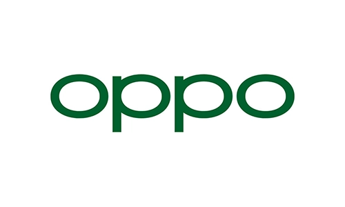
Oppo’s logo evolution tells the story of a brand growing up and finding its identity.
The meaning: “Oppo” doesn’t have a literal meaning, but it’s designed to be easy to pronounce in multiple languages and sound friendly and approachable. The green color represents youth, vitality, and innovation.
The design: The current lowercase, rounded font gives off a modern, friendly vibe. It’s saying, “We’re sophisticated but not stuffy.”
Hidden detail: The two ‘p’s in Oppo are perfectly symmetrical, creating a sense of balance and reliability. The oval shape of the letters suggests completeness and perfection.
Vivo: Living Life to the Fullest
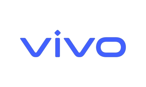
Vivo’s logo might seem straightforward, but it’s all about that brand philosophy.
The story: “Vivo” means “alive” in Latin, and the brand wants to remind you to live fully in every moment. Their tagline used to be “Make yourself heard,” emphasizing self-expression.
The design: The blue color represents trust, intelligence, and efficiency. The clean, modern font suggests technological sophistication without being cold or distant.
Hidden detail: The ‘V’ in Vivo has a slight forward slant, subtly suggesting movement and progress into the future.
Motorola: The Iconic Batwing That Survived Everything
Motorola’s logo – affectionately called the “batwing” – is one of the most recognizable symbols in tech history.
The story: The stylized “M” was designed in 1955 (way before smartphones!) and has survived countless corporate changes, mergers, and near-death experiences. It represents the peaks and valleys of radio waves, paying homage to Motorola’s roots in radio communication.
The evolution: While the logo has been refined over the decades, that basic “M” shape has remained consistent – a testament to its timeless design.
Hidden detail: The two peaks of the “M” are said to represent continuous innovation and the company’s dual focus on communication and technology.
Nokia: From Rubber Boots to Smartphones
Before Nokia became synonymous with indestructible phones, they made rubber boots and toilet paper. No, really!
The story: Nokia is named after the town of Nokia in Finland. The logo has been through numerous iterations, but the current clean wordmark represents the company’s rebirth and focus on telecommunications infrastructure.
The design: The blue color represents reliability, intelligence, and communication. The clean, modern font suggests Nokia’s evolution from a manufacturing company to a tech innovator.
Fun fact: The old Nokia tune? It’s actually based on a 19th-century Spanish guitar work called “Gran Vals” by Francisco Tárrega. One of the most recognized sounds in the world came from classical music!
Google Pixel: Hidden in Plain Sight
![]()
Google’s Pixel brand has one of the cleverest logos, and most people completely miss the hidden meaning.
The story: The “G” in the Pixel logo is composed of four colors from Google’s brand palette, directly connecting it to the parent company. But here’s the cool part – look closely at the negative space inside the “G.”
The design: Those Google colors (blue, red, yellow, and green) represent Google’s playful, innovative spirit. The clean, modern font screams “We’re the future of smartphones.”
Hidden detail: The “G” is designed to look like a stylized camera lens or aperture, emphasizing Pixel’s focus on photography and AI-powered cameras. Mind. Blown.
Sony Xperia: The Experience in Your Pocket
Sony’s Xperia brand combines legacy with innovation in its logo design.
The meaning: “Xperia” comes from “experience,” representing Sony’s goal of providing a complete entertainment experience through their phones. The logo connects to Sony’s broader brand identity while maintaining its own personality.
The design: The clean, minimalist approach reflects Japanese design principles of simplicity and functionality. The choice of fonts and spacing creates a sense of premium quality.
Hidden detail: The Xperia logo often appears in a reflective, glossy finish that mimics the premium glass and metal construction of their phones.
LG: Life’s Good (Really, That’s What It Means!)
LG’s logo is a smiling face, and once you see it, you can’t unsee it!
The story: “LG” stands for “Lucky Goldstar” (the company’s original name), but their modern slogan is “Life’s Good.” The logo combines an ‘L’ and ‘G’ into a stylized face that’s supposed to be winking at you.
The design: The red circle represents humanity and youth, while the winking face conveys friendliness and approachability. It’s designed to make technology feel less intimidating and more human.
Hidden detail: The nose of the face is actually the ‘G’ in LG, and if you look at it right, the whole thing looks like the classic Pac-Man character!
HTC: Quietly Brilliant (But Not Quiet About Their Logo)
HTC’s logo might be understated, but it represents a company that pioneered smartphone innovation.
The meaning: HTC originally stood for “High Tech Computer,” but the company later adopted “Here, There, Closeness” to represent connectivity. Their tagline “Quietly Brilliant” perfectly captures their approach to innovation.
The design: The green color represents growth, harmony, and freshness. The simple, lowercase font suggests approachability and modernity without being flashy.
Hidden detail: The spacing and proportions in the HTC logo are based on principles of typography that make it highly legible even at small sizes.
BlackBerry: The Business Icon That Defined an Era
BlackBerry’s logo – both the wordmark and the iconic blackberry fruit – represents a specific era in smartphone history.
The story: The name “BlackBerry” came from the fact that the phone’s keyboard buttons looked like the seeds on a blackberry fruit. The logo often featured the fruit alongside the wordmark.
The design: The professional, clean font and often black-and-silver color scheme targeted business professionals. Everything about the logo screamed “serious business tool.”
Fun fact: BlackBerry’s marketing team considered over 40 different names before landing on BlackBerry. Imagine if they’d chosen “Strawberry” instead!
Realme: The Bold Newcomer Making Waves
Realme is one of the newest players in the smartphone game, but their logo packs a punch.
The story: “Realme” represents authenticity and being real with consumers. The brand split from Oppo to target younger, tech-savvy users who want flagship features without flagship prices.
The design: The bold, yellow wordmark is impossible to ignore. Yellow represents optimism, clarity, and warmth – perfect for a brand targeting millennials and Gen Z.
Hidden detail: The slight italics in the font suggest forward movement and dynamism, reflecting Realme’s rapid growth and ambitious goals.
Asus: The Mythical Creature in Your Pocket
Wait, Asus makes phones? Yes! And their logo has one of the coolest origin stories in tech.
The story: “Asus” comes from “Pegasus,” the mythical winged horse from Greek mythology. The founders dropped the first three letters because they wanted Asus to appear near the top of alphabetical business listings. Smart!
The meaning: The Pegasus represents wisdom, creativity, and the spirit of innovation soaring to new heights. It’s aspirational without being pretentious.
Hidden detail: While the Pegasus itself doesn’t appear in the modern logo, the company’s commitment to “inspiring and empowering” users remains central to their brand identity.
The Psychology Behind Smartphone Brand Logos
Now that we’ve explored individual logos, let’s talk about what makes these designs actually work.
Color psychology matters: Notice how many tech brands use blue? That’s because blue conveys trust, reliability, and intelligence. Red brands (like Huawei) want to appear energetic and passionate. Green brands (like HTC and Oppo) emphasize growth and harmony.
Simplicity is king: The most successful smartphone brand logos are simple enough to recognize instantly, even when they’re tiny on the back of your phone or in an app store listing. If you can’t sketch it from memory, it’s probably too complicated.
Cultural considerations: Global brands have to ensure their logos work across different cultures. What looks great in the US might have unintended meanings in Asia or Europe.
Evolution is necessary: Notice how almost every brand has updated their logo over time? That’s because good logos need to evolve with design trends while maintaining brand recognition.
Frequently Asked Questions
Which smartphone brand has the oldest logo design?
Motorola’s “batwing” logo dates back to 1955, making it the oldest smartphone brand logo still in use today.
Why do most smartphone logos avoid using multiple colors?
Monochrome logos are more versatile, easier to reproduce across materials, and appear more professional and timeless than multicolored designs.
What does the bite in Apple’s logo actually represent?
The bite prevents confusion with other round fruits and provides scale. It also creates a play on “byte” in computing.
Are smartphone logos designed in-house or by agencies?
It varies. Some brands use internal design teams, while others hire specialized branding agencies for millions of dollars.
Why did Nokia abandon its iconic logo style?
Nokia simplified its logo to represent its transformation from consumer electronics to telecommunications infrastructure and technology licensing.
What makes a smartphone logo successful?
Successful logos are simple, memorable, scalable, timeless, and relevant to the brand’s values and target audience.
Do smartphone companies trademark their logo colors?
Yes! Many brands trademark specific color combinations (like T-Mobile’s magenta) to prevent competitors from copying their visual identity.
Which smartphone logo has changed the most over time?
Samsung’s logo has undergone numerous transformations since the company’s founding, evolving from complex designs to today’s minimalist oval.
Why do Chinese phone brands often have simpler logos?
Simplicity helps with international recognition and pronunciation, making it easier to expand into global markets beyond China.
Can a logo really influence phone buying decisions?
Studies show that logo design affects brand perception, which influences purchase decisions and brand loyalty significantly.
Next time you unlock your phone or walk past a store display, take a second to appreciate the thought, strategy, and creativity packed into those tiny symbols. They’re not just logos – they’re stories, philosophies, and promises all rolled into one instantly recognizable image.