If a company ends up changing its brand logo, which means it has taken a huge challenge. Rebranding may lead to a huge loss for the company if it does not reach the consumers in a positive way. We’ve put together the world’s largest companies to find more subtle examples of bad logo designs. Let’s have a look!
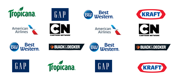
American Airlines
After 40 years, in 2013, American Airlines introduced a new logo that was designed by Futurebrand. The design of the logo contains the same colors including the eagle. But people miss the bold, grand look of the old logo.
Cartoon Network
The first logo of this channel was utilized from 1992 to 2004. The brand name was written on a chessboard. Each cell was either white or black. The second logo of the brand was used from 2004 to 2010 by showing that in 2 tilted cubes including ‘C’ and ‘N’. The third brand logo was used from 2010 to till date. The design was similar to the second logo. But the shadow was removed from the cubes.
Who Owned Cartoon Network?
- A. The Warner Bros
- B. National Broadcasting Company
- C. CBS Entertainment
- D. CW Network
The company started to introduce new cartoon characters with the brand new logo that became a major blow for the company.
Best Western
The company modified the logo after 22 years, but it lost the brand quality which was built up by the previous logo. The former logo was popularly known for its strange color scheme, unusual typography, and slightly look-like crown emblem, which people still remember in their hearts. The new logo was introduced in 2015 by displaying short form Best Western as “BW.”
Black & Decker
This brand’s previous logo had a unique nut icon and bold condensed font. The logo was replaced by the new one that was created by New York consultancy Lippincott in 2014.
Gap
You will be shocked to learn about gap rebranding. The Gap brand has used a classic type-based logo since 1984. Suddenly the company revamped the logo. It was designed by Laird & Partners. The new logo was introduced in 2010. As stated by a Gap spokesperson at the time and spoke about the new logo that, “classic, American design to modern, sexy, cool.”
Tropicana
Here is another brand logo design that went wrong! The logo lost the iconic ‘orange speared by a straw’ emblem. The company realized that the logo should never have been changed. It was like a complete disaster and the sales dropped by 20 percent because consumers were unable to identify their favorite brand after changing the logo. Hence it was replaced with the previous design within two months. The short-lived new logo was introduced in 2009.
Kraft
This classic ‘racetrack’ logo was actually for Kraft Foods. Kraft Foods Inc the corporation introduced a new logo in 2009, which was different and zero in common with the old one.